The concept sketch from the summer.
I don't I want to keep the bun.
Throughout this week I have simply been working off my ideas in the summer involving the character from Persona 5, Futaba Sakura. I have only finished the head since I want to revise my original idea. Looking at these drawings and ideas, they seem to be very plain and I want to use some techniques from the previous investigations to make it better.
The progress I made this week. I didn't know what
I wanted to do for the piece
so I stuck with making the head look human.
In Persona 5, a group of teenage rebels explore a place called the Metaverse to change the corrupt desires of the adults around them. Each member of this group have personally gone through some experience with a corrupt adult, and finds their true self aka persona and fights back. For Futaba, she was constantly accused by family and friends for her mother’s death which really stood out to me. For the piece, I want to include this message of standing up against the people who hurt and bring you down.
I like the color scheme used in this and want
to use this for the piece.
Of the former blog posts I have done, I definitely want to include some of Shepard Fairey’s use of color and text into the piece and David Salle’s use of layering. For text and image, I have been thinking of using two things: “I killed no one” and an excerpt from the suicide note or quotes of people blaming her for killing her mother. I also want this to layer over the original photo and use various angles like David Salle. I will be doing this in Photoshop rather than just trying to do it in one go. I also want to add action or a design in the background so it isn’t just white in the background. I like how Fairey fills up space in his pieces by including patterns and quotes in the background of his art. I definitely want to do something like this for my art. I’ve personally been thinking of using the colors in Futaba’s outfit and using patterns that are used throughout in the game.
Some main designs in the game:
Jagged lines and stars along with the star in a star ina star design. Splatters are also commonly used. This gives emphasis and motion which I should include in the background.
Broken pieces and the color scheme
red and black are big in this game and should be included. I think I will make the
background broken and jagged to fit this design.
Concept Sketches: Throughout the game, Futaba has been described as being buried in a coffin and suffocating from guilt over her mother’s death, so for my first concept, I decided that I should incorporate that idea into it. I wanted the text to be at an angle in the top left corner. Personally, I thought the meaning behind it was cool, but the position was awkward and I could not think of anything better to do to incorporate the coffin. I did like the patterns in the corner though and I personally thought patterns suited the game.
The second concept that I think I will be doing and working on for the remainder of the piece is just a variation of the original concept. When working on this simple sketch, I thought of just layering the text onto the jacket rather than including it into the background which I thought was cool and conserved space. I also think I should use a pattern more like the previous concept than this one since it sticks to the original design of the game rather than just some random design. Personally, I like the pose and the variety of things I can add to this concept in the future than the other which is why I want to work of this.
Work Log:
Monday- modeling head
Tuesday- modeling head
Wednesday- modeling glasses and teeth
Thursday- modeling eyes and eyelashes
Friday- modeling ears
Shepard Fairey is an American graphic artist and social artist who well known for his part in the street art movement. Fairey’s passion for art began when he was a teenager when he began to use his drawings for t-shirts and skateboards at the shop he worked at during the time. Along with this, he began to post pictures around in the community. This is when his interest for street art began. Later on, he attended the Rhode Island School of Design where he earned his bachelor’s in fine art. During this time, Fairey created one of his most famous pieces/brands, Obey when he saw the Andre the Giant picture in an ad on the newspaper. Later in 2009, Fairey created another phenomenon when he took senator Barack Obama and created a poster with the words “hope” on it. The trends and other Shepard Fairey works have also been appearing in museums as well like the Smithsonian in Washington D.C.. Lately, rather than showing support, Fairey has been working on posters of culturally diverse women while using the colors red, white, and blue in response to Trump’s policies.
As a social activist, many of Fairey’s art is political based. Some common themes would be Fairey’s detest for the Iraq war, occupying Wall Street, and currently Trump’s views on immigration. Fairey also gains inspiration from the world and media around him. Fairey likes to blend commercial, fine and street art into his own. Fairey displays his art through many forms like stickers, prints and posters. Lastly, Fairey mainly likes to use the colors red, white, and black in his art.
Some of Shepard Fairey's Art:
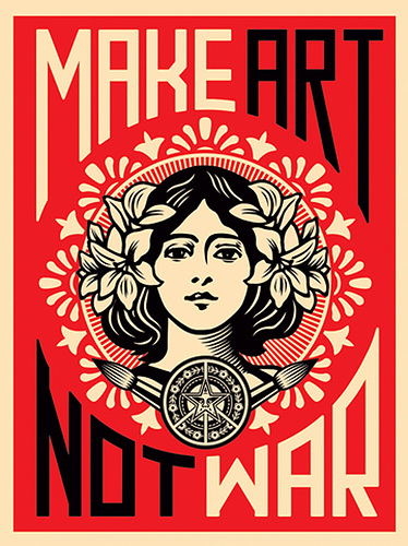
I love the printed effect of Fairey’s art and I think I would like to try this with some of my works too. Along with this, I like Fairey’s choice of colors and how they all blend together nicely. Also, for pieces like the girl in “make art not war” and “paint it black” I like the patterns in the background and how it kind of singles out the piece or focus in the piece. I also like how Fairey uses recurring images in his art and will change the words and meaning to the image. Lastly, I like how Fairey uses words in his art. I like how they don’t stand out as the main piece, but still make a big impact to the piece. I also like how they blend in with the piece whether it makes it appear like a poster or are in the image itself.
In conclusion, I’ve learned that text and image can take an image and can completely change the meaning or thought of it into something else. I’ve noticed that contemporary artists mainly use text and image to share a message or viewpoint on a topic by adding it to an image that people generally wouldn’t relate to it or not think of straight away. I think I will use text and image to share my thoughts or personal experiences in my art. Along with this, I think I will be using text and image in a similar fashion to Fairey, by making it appear more like a poster. Lastly, I was definitely inspired a lot by Shepard Fairey’s art. I don’t think I will follow this style directly, but I am definitely inspired by the poster look and his use of multiple colors in his work.
David Salle is a painter who began his art career as a nine-year-old who took life drawing classes at a local organization. These classes would spark Salle’s interest in drawing and painting. Once Salle graduated high school, he attended the California Institute of Arts where he shadowed under the artist John Baldessari who sparked a passion for abstract art and helped Salle feel free when making art. Once Salle graduated, he moved to New York and began to pick up tiny jobs to support himself as well as shadow under other artists. One job was making pin-ups for a magazine company that later shut down and left Salle with photos that will inspire and be in his future works. Eventually, Salle began working in theater. He would make costumes and set the stage for works like The Birth of the Poet. Afterwards, Salle began to explore other art forms like photography and film which would eventually be displayed in museums. Finally, in 2004 Salle began to explore collaging which transformed into his current art style.
David Salle’s art focuses on three main things: form, shape, and color. Salle’s art is similar to a collage but includes many different forms of art like painting, printmaking, and photography. Salle also likes to mix realistic drawings and photos with more cartoonish photos and includes different styles to it like contour line drawings. Salle’s art also has many different shapes and objects to it. Salle likes to take objects and bring it out of context into his art and in his art, it is obvious that nothing really goes together. Lastly, Salle depicts different moods in his art with the use of various colors
Some of Salle's Works: Of these paintings, I really like the one with the pie and bed. I like the bright colors used as it catches my eye. I also like the various shapes used in it like the triangular pie slice and the rectangular bed. Also, I like the painting with the car and the girl. I like the unity in the colors and the subjects in the painting do make some sense together which I prefer over the other paintings where the objects relate in no way. I also like how the objects are in various angles and it kind of makes me think of a summer day with the ice cream and the bright colors. Lastly, I like the painting with the snowman. Unlike the other paintings, I get a different feeling when looking at this painting. I feel the good majority of black and white makes me think of a memory and I would to try this out in my art as well.
When it comes to Salle’s work, I personally like the colors. The colors are bright and appealing to the eye. I also like the layering in Salle’s art, but I do not like how Salle combines various objects that don’t make sense together. If I were to use layering in my art, I would definitely have them relate in some way. Along with this, I like how Salle combines various forms of art and layers it on top of one another. I personally like the photos he includes with the paint. The juxtaposition between the black and white photos and the bright and colorful paintings is very nice and really emphasizes how none of the things in the paintings relate.
In conclusion, I have learned that layering is a collage where one puts images on top of one another, but could also include various forms of art like paintings and videos and contemporary artists use layering to convey multiple moods in one piece or to tell a story. I think I will use layering to layer photos into my art and possibly animate those photos as well. In my investigation, I was specifically interested in Salle's use of different forms of art. It makes me want to explore with my art in a similar fashion like possibly drawing or painting something and scanning and using it in my art.
Tim Burton is a filmmaker, animator and artist with a dark art style that is very well known throughout the art community. This style developed during his childhood since he often felt like an outcast at school and was often lonely. Because of this, Tim Burton would often draw. He usually would draw monsters who were timid to make them more relatable to himself. One of Burton’s biggest supporters was his art teacher who never forced Burton to conform to society’s standards of art. This freedom allowed Burton to grow as an artist. As he grew up he attended to the California institute of Art and later got a job as an animator with Disney. During this time, Burton was very constricted since his style is very different from the company’s and his ideas for films were constantly rejected due to their creepy nature. Eventually, Burton left Disney and began to make his own films without being restricted.
When it comes Burton's art style, tends to do whatever he feels whether it is animating, drawing,or film making Some common themes in Tim Burton’s art were simplicity with his drawings usually only consisting of the subjects and a white background. Along with this, Burton’s drawings contain a myriad of strokes like lines and whirlwinds that add to the chaotic and creepy vibe to the characters. Burton also uses a variety of utensils like crayons, paints and markers. Burton usually gains inspiration from the people around him. He tends to fill his art with social commentaries like the economy, hierarchy, self image and conformity. This is done to show life in different perspectives.
One of his movies, Sweeney Todd: The Demon Barber on Fleet Street, entails a barber’s return to his hometown after being banished by a corrupt judge who was only after his wife. When having heard of his wife’s apparent suicide, he vows revenge on the judge and begins to slit peoples throats out of rage, which Ms. Lovett then uses to make meat pies. The two main parts of the movie I enjoyed artistically were the intro and the beach scene.
The Intro:
At the beginning,I loved the animated rain next to the blurry painted background. I personally felt that the rain contrasted with background which brought more focus to it. Along with this, I liked the general movement of the buildings, the informal balance in the scene and the perspective of some buildings being bigger than others and the black on the fronts that give the viewer the feeling of the building being right in front of them. Later on, there is this mix of 3D and 2D which I feel was a good thing because helped put emphasis on the 2D blood and added variety and motion to other parts like the meat grinder. Lastly, I love the scene with the blood pouring into the sewer. I love the 2D blurry background of the sewers and the very realistic water. This, like the 2D and 3D animated parts earlier creates emphasis on the water flowing and less on the background which I really enjoy looking at.
By the Sea:
For the most part I enjoy this scene for the backgrounds. I felt when watching this that the main characters and the background are two separate things. Unlike Burton’s drawings that usually have a plain white background, the background are a little more lively and pleasing to the eye. I also believe these backgrounds are generally fake and were created, especially the scene leading to this with the tree. I like this because of the contrast it brings to the characters from such a bright lovely background.
In conclusion, I have learned that hybridity is a form of art that takes many simple art forms and brings it together to create one piece of art. Since the world today is much different than the way it was back then, I believe contemporary artists take an idea or subject and use hybridity to better express it our to make it more complex and bring greater meaning. I think I will stay digital when it comes to my art, but I think I might add some video or photos I shoot on my phone in my art if anything I come across sparks an idea for art in my head. In these cases I am thinking of collaging those videos into my animations or renders using photoshop. It isn’t really hybridity related, but the beginning part of the opening credits of Sweeney Todd really caught my eye. It makes me want to use real life photos for backgrounds and explore and include 2D animation in my art.
The two themes I am mainly interested in is looking outward and looking inward. These themes interest me because they focus on emotions and life experiences. I could not really choose which one I wanted to focus on more because I kind of want to incorporate a mix of both in my pieces. I like these themes because I can take my emotions and experiences an make art out of it. By doing this I can take normal life and put my opinions and perspective into it.
Some ideas I have for art throughout the school year are basically things I have seen, dreamed, or felt. I also want to do more realistic pieces with my family, school and my culture. This will be done with animations and rendered photos. Some artworks I want to attempt to give a realistic feel, like with pieces that fully focus on family and culture, but for others I want to make pieces that focus more my inner feelings and thoughts to be more abstract and simple while adding a little fantasy to it.
Some things that has been peaking my interest lately have been art in the form of gifs.
This is definitely something I want to look into during the year. I’ve also been looking at 3D models who have very realistic clothes that you can see the fibers on them.
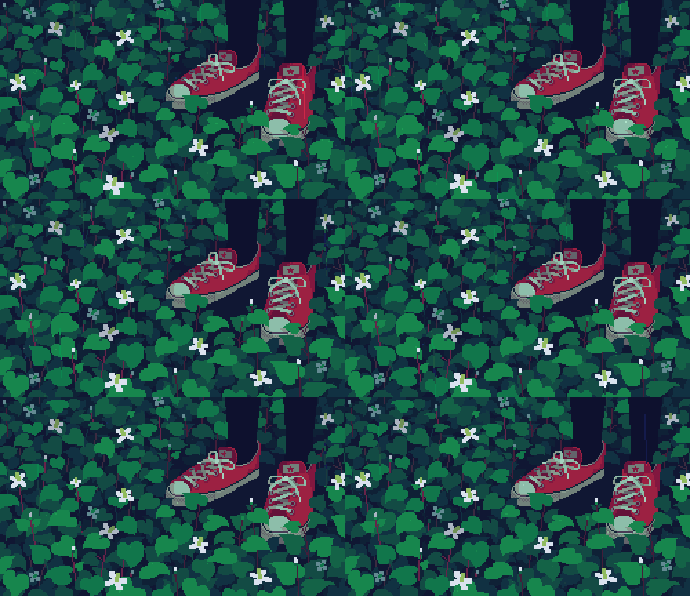
This is something I want to look into along with hair and hairstyles to help make my more realistic pieces look believable. Lastly, I’ve been looking into 3D art looking more 2D similar to this piece:
I feel I generally want the majority of my pieces to have an appearance similar to this, in terms of the looks and not the color, so this is definitely something I want to look into.